Refreshing the Sanuk Look
An updated look for the surfer boys ‘n girls at Sanuk. We explored and refreshed the brand’s logotype to feel a little more clean and with the times without sacrificing the brand’s equity while keeping the original bones in tact.
SP21 Season Concepting
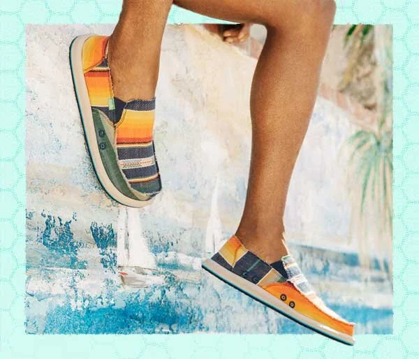
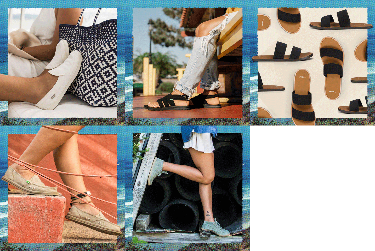
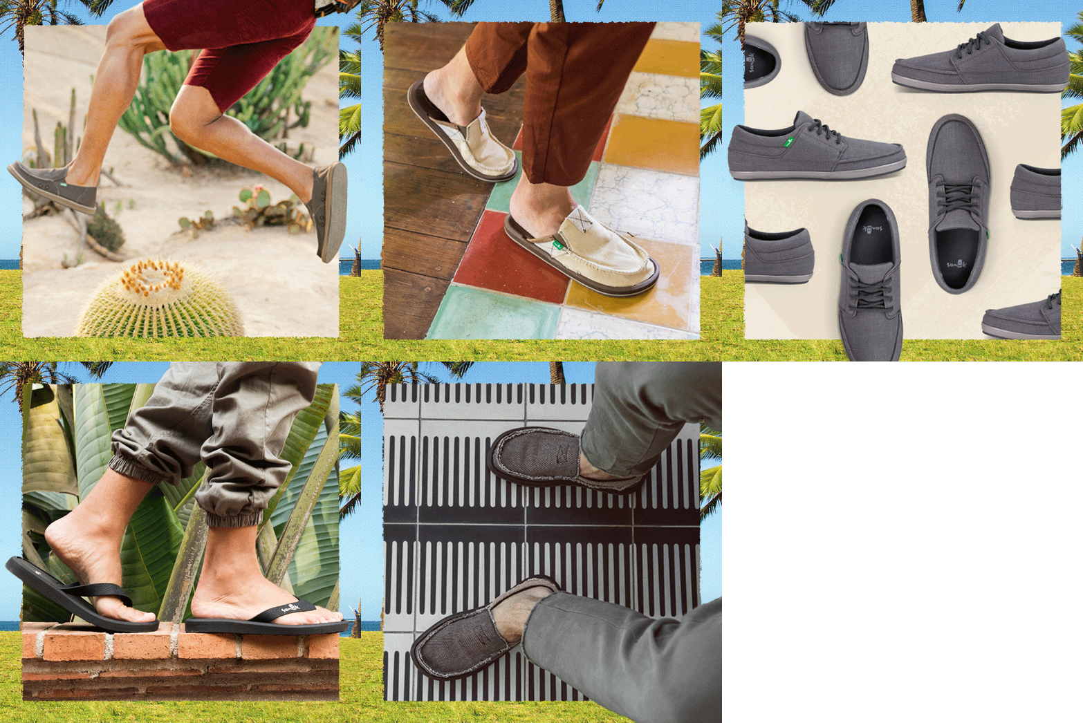
Concept design exploration for Sanuk’s latest spring season. Inspired by the brand’s past seasonal art directions of collage, illustrative assets and surrealism, the goal was to explore a concept using simple shapes and photography while keeping the surrealist, collage vibe alive.
Graphics Over the Seasons
A collection of selected retail, digital, and print graphics I’ve assisted the Sanuk team on from over the seasons at Jolby.


